Reimagining the user experience
💡Discover
What was this initiative?
In Q1 of 2021, I led an initiative to fund the reimagining of the Greenhouse product. The main driver being to align more closely with our brand and company pillars, aiming to "make everyone great at hiring."
Why?
Over time the product experience has been additive, building in flexibility and configurability, but in turn causing compounding complexity to the UI. This made it difficult for users outside of the talent team to embrace the platform.
Research
We reviewed both quantitative and qualitative data to learn that there was a large opportunity to reduce the learning curve for our customers. We reviewed our internal data, surveyed 850 users and performed 12 user interviews across our segments.
51% of users said Greenhouse has a steep learning curve
17% of customers cited usability as a reason for churn
Words like steep learning curve, lots of clicks, unintuitive appeared across the user interviews, and raw data (sales, churn, and NPS).

✏️ Define
Goals:
Our research led us to believe we had a huge opportunity for our customers and our company to make the application easier to use. We believed that in doing this, we will
For our users:
Instill more confidence in hiring processes and decisions
Provide opportunities to learn (best practices, DE&I, structured hiring)
Go from liking to loving Greenhouse product
For our company:
Increase sales and adoption
Increase our NPS score specifically reduce negative sentiment towards usability
Reduce tech debt to allow for faster product innovation
🎨 Design
We broke this into 3 phases of work.
1. Unify the Experience
Through our research, we learned that the overall product experience can be hard to use because the design had evolved through the years causing inconsistency across elements.

Image of main inconsistent list views across Greenhouse
Our first phase of work was to create a comprehensive design system—Seedling. Having consistency across all elements will help take the guesswork out of the different customer journey’s. While we had a design system currently in production, it lacked ownership and engineering buy in. With this project, we were able to work with a new engineering team dedicated to rebuilding seedling.
We audited every element across the application to define and document commonalities and use cases and documented rules. This will allow both the design team and engineering partners to work more quickly, and for customers to comprehend the functionality across all pages more easily so they will gain familiarity, reliability and control over each individual experience.

Example of our updated design system styles
2. Guide users to learn hiring best practices
We aim to recommend the most impactful actions to help users get the most out of the product functionality and help people learn hiring best practices.
Having a deep understanding of the application takes time, while product complexity has impacted this, the product team made specific choices to give customers the tools and let them create their own processes. This led to inability to provide contextual help or guidance within the product.
For example our candidate profile, which is the most trafficked page in our application had a huge usability problem. It became a main core project for optimization. There were a ton of actions on the page, many different views and nothing that specifically calls out to you and says “this is the primary thing to do right now.
In order to help users learn our best practices, we need to help show them which actions to take next. We have reimagined the layout and design to better assess and action each candidate more quickly by organizing content in a way that focuses experiences, driving a preferred method of action and grouping secondary actions behind a click.

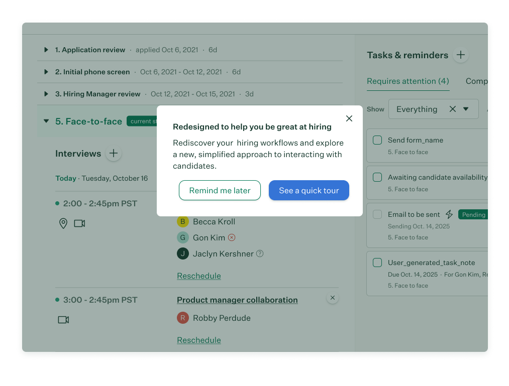
We also introduced onboarding and enablement popovers for in app help when users get stuck.
3. Improve access and accessibility
This third idea was a net new concept that spoke to our company mission, make everyone great at hiring. With our new goals of consistency and guidance, we also wanted to build a more equitable framework that is designed to be universal and inclusive.
The team focused on accessibility and responsive as the two core opportunity areas for improvement. We then hired an accessibility consultant to audit both our design system and the newly built experience using our system.
Some focus areas for us was making the app compatible with assistive technologies, allowing users to use their keyboard so they can tab between elements and making sure visual cues can be perceived in multiple ways instead of our scorecard icons changing color, it also changes shape.


🚚 Deliver
Roll out
This initiative kicked off in 2021 but continues as a design vision for the future of the Greenhouse product. We started as a team of 3 eager designers and 2 engineers wanting to improve the design system. It has led to a complete overhaul of how the team thinks, designs and works together.
I even had the opportunity to present this initiative at OPEN, our recruiting conference during our keynote speech.

Final takeaways
25% decrease in NPS comments related to usability
We’ve released 10 core workflows that have been deemed fully accessible.
Our navigation and most trafficked pages are responsive across multiple screen sizes and devices
Customer adoption has increased by 45% due to our new learning guides and popovers
Birch, our new design system has resulted in an 80% reduction in front end engineering implementation time
View the press releases about the redesign and updated candidate profile here and here.