pro availability
A cleaner is an independent contractor that joins the platform to claim jobs. Each cleaning was “claimed” as a singular and fleeting job. In late 2016, we wanted to tackle the issue that Handy’s professional base was underutilized. Pros wanted to work more jobs than they had been offered. How can we get professionals to claim more jobs and hit max capacity? How does Handy predict which cleaners are left unfulfilled and target them to work more? Will an increase in job frequency positively affect Pros retention on the Handy platform?
Goal:
Create an availability calendar to capture intent for work; allow the professionals to:
- Update regularly to provide accuracy
- Show multiple views by Month, Week, Day, Hour
- Understand intent vs utilization
- Maintain hours easily
- Future goal: use this calendar to allow customers to book a professional directly
Research
- Is this something Pros want/ will use?
- What is the most intuitive way to input their hours?
- When do they know their availability? 1 month before? 1 week? 1 day?
- How should this affect their current job schedule?
- How will they understand “available to work” vs “working”
- How can setting their availability benefit them?
- Where should this live in the app?
I started my research by understanding the technical capabilities. How had other companies solved this problem? Android & iOS time pickers were best used for one off times and not multiple ranges over many days.

These interactions seemed like a lot of work for every day and sometime multiple ranges. How do other time pickers (e.g. Outlook, Zocdoc, Mindbody, Opentable, Square Appointments, Doodle) work?

Usability Testing
In the first user session, I brought in 10 highly rated professionals (cleaners that do at least 3 jobs a week with a rating of at least a 4.7.) I created a bunch of different types of prototypes to discuss how our user base interacts and thinks about their availability. I asked the pro’s to explain their thoughts while engaging with each prototype. I listened to them explain and dwell on what they liked and didn’t like.

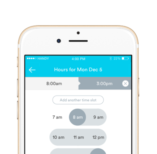
Option 1
Choosing date and time separate (inspired by iOS interface.) Pros understood to tap a day and then edit hours separately. They understood the start and end time and added a second time range. They all agreed it was fine, made sense, and understood how to use it. However based on my prediction, they all agreed that using the scroller seemed like a lot of work.
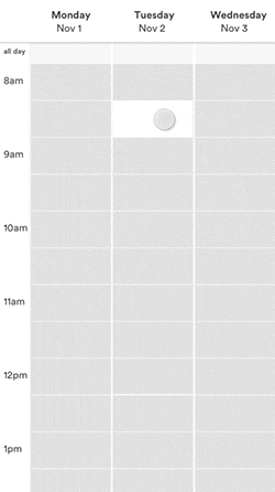
Option 2
Choosing by time blocks (inspired by Doodle’s interface.) This was hard for the pros to visualize because correlating the date and time as rows and columns made them have to take a second to think what each block represented. They liked seeing multiple days at once but wanted it to be a full week view. They liked the “add another” button because it was direct and allowed them to understand that selecting multiple ranges was acceptable. But they did not know how to get to Thursday or that you couldn’t see a full day at once.

Option 3
Selecting ranges by day (inspired by opentable/zocdoc.) This felt the most direct because they knew they were creating monday’s schedule and the actual cell they are tapping correlated directly to the “time.” They tapped every cell stating they were available each hour but didn’t understand that they could select a “start and end.” This was missing a few things. A visual cue that it was time ranges, how to select multiple ranges and how to select Tuesday.

Option 4
Editing within a calendar view (inspired by Outlook). Did not understand the color and hashes meant different things. Understood and liked the feature once it was explained to them, but gravitated toward option 3 more. Did enjoy that it was apart of their current schedule view
Learnings
After talking and testing prototypes with cleaners, I learned that they wanted a way to see both week and day view. Month wasn’t necessary because they don’t know their schedules more than a week or 2 out. Direct associations to what they are tapping was a better treatment than visual cues. Understanding both how to input ranges and that their was a “start” and “end” time was important features.
Combining the learnings from my first round of research, I decided to take all the feedback and work off option 3. This option reminded me most of travel sites— like Airbnb, Kayak, Jetblue and Delta. I decided to research this functionality most closely and see how I could represent it similarly for day and time. All of these time range pickers had different functionality, for instance, what happens when you tap dates and then edit them? Or tap the center between the 2 points? I decided I needed to test again with pros and understand functionality for editing.

The revised prototype felt nearly complete. It combined all the feedback from pros. I showed this to 8 users and asked them to do a bunch of tasks. The results were positive, all of them were able to understand how to set their weekly availability, add a second time slot, edit their start/end time and review their week at a glance. (One professional even hugged me because they were so excited to use this feature.)

The final result was built and recently released for pros. Over the last 6 weeks, there has been a 85% utilization week over week. This new availability calendar will be the first of many new features to help professionals get more work. Knowing when a professional wants to work gives Handy the opportunity to send professionals targeted jobs based on their availability. Helping pros get more work means they will make more money and be happier and more satisfied with Handy.